40 Best Data Visualization Tools and Software list for 2026
Data visualizations are everywhere today. From creating a visual representation of data points to impress potential investors, report on progress, or even visualize concepts for customer segments, data visualizations are a valuable tool in a variety of settings. When it comes to big data, weak tools with basic features don’t cut it. The following Data visualizations tools are some of the best, most comprehensive, sophisticated-yet-flexible visualization tools available and all are capable of handling big data.
Many of these tools are Open-Source, free applications that can be used in conjunction with one another or with your existing design applications, using JavaScript, JSON, SVG, Python, HTML5 or drag-and-drop functionality with no programming required at all. Others are comprehensive business intelligence platforms capable of sophisticated data analysis and reporting, complete with a multitude of ways to visualize your data. Whether you need to analyze data and determine the best ways to present it to clients or partners, or you have a visual layout in mind and need a tool to bring your concept to life — there’s a tool on this list to serve your needs.
What is Data Visualization?
Graphical representation of any information or data is known as Data Visualization. This helps in segregating the data in an efficient manner by using various types of visuals such as graphs, maps, charts, maps, and visualization tools. In addition to this, with the help of a data visualization tool, the data can be presented in a very unique and understandable manner so that people who are not from a technical background can understand everything easily.
What are Data Visualization Tools?
Data Visualization Tools are software platforms that provide information in a visual format such as a graph, chart, etc to make it easily understandable and usable. Data Visualization tools are so popular as they allow analysts and statisticians to create visual data models easily according to their specifications by conveniently providing an interface, database connections, and Machine Learning tools all in one place!
Best Data Visualization Tools
Here are the most popular Data Visualization tools list and software that companies and business professionals are using . So let’s check them out!
1. Tableau
Tableau is a robust tool for visualizing data in a better way. You can connect any database to create understandable visuals. It is one of the best visualization tools that enables you to share visualization with other people. Tableau is a best data visualization tool that can be used by data analysts, scientists, statisticians, etc. to visualize the data and get a clear opinion based on the data analysis. Tableau is very famous as it can take in data and produce the required data visualization output in a very short time. And it can do this while providing the highest level of security with a guarantee to handle security issues as soon as they arise or are found by users.
2. Power BI
Power Bi is a Business Intelligence and top Data Visualization tool which helps you to convert data from various data sources into interactive dashboards and reports. It provides multiple software connectors and services..
3. Qlik
Qlik is a data visualization software which is used for converting raw data into knowledge. This software acts like a human brain which works on “association” and can go into any direction to search the answers.
4. Looker
Looker is a data visualization tool that can go in-depth into the data and analyze it to obtain useful insights. It provides real-time dashboards of the data for more in-depth analysis so that businesses can make instant decisions based on the data visualizations obtained. Looker also provides connections with Redshift, Snowflake, and BigQuery, as well as more than 50 SQL-supported dialects so you can connect to multiple databases without any issues.
5. Sisense
Sisense is a business intelligence-based online data visualization system and it provides various tools that allow data analysts to simplify complex data and obtain insights for their organization and outsiders. Sisense believes that eventually, every company will be a data-driven company and every product will be related to data in some way. Therefore it tries its best to provide various data analytics tools to business teams and data analytics so that they can help make their companies the data-driven companies of the future.
6. IBM Cognos Analytics
IBM Cognos Analytics is an Artificial Intelligence-based business intelligence platform that supports data analytics among other things. You can visualize as well as analyze your data and share actionable insights with anyone in your organization. Even if you have limited or no knowledge about data analytics, you can use IBM Cognos Analytics easily as it interprets the data for you and presents you with actionable insights in plain language.
You may also like:
Data Science – The MUST KNOW to become a successful Data Scientist!
How can software engineers and data scientists work together?
Top Data Scientist Skills You May Need In 2026
Essential Tips for Beginner Data Scientists
What Data Scientists Need to Know About SQL
7. Domo
Domo is a business intelligence model that contains multiple online data visualization tools that provide a consolidated platform where you can perform data analysis and then create interactive data visualizations that allow other people to easily understand your data conclusions. You can combine cards, text, and images in the Domo dashboard so that you can guide other people through the data while telling a data story as they go.
8. Klipfolio
Klipfolio is a Canadian business intelligence company that provides one of the best data visualization tools. You can access your data from hundreds of different data sources like spreadsheets, databases, files, and web services applications by using connectors. Klipfolio also allows you to create custom drag-and-drop data visualizations wherein you can choose from different options like charts, graphs, scatter plots, etc.
9. SAP Analytics Cloud
SAP Analytics Cloud uses business intelligence and data analytics capabilities to help you evaluate your data and create visualizations in order to predict business outcomes. It also provides you with the latest modeling tools that help you by alerting you of possible errors in the data and categorizing different data measures and dimensions. SAP Analytics Cloud also suggests Smart Transformations to the data that lead to enhanced visualizations.
10. Yellowfin
Yellowfin is a worldwide famous analytics and business software vendor that has a well-suited automation product that is specially created for people who have to take decisions within a short period of time. This is an easy-to-use data visualization tool that allows people to understand things and act according to them in the form of collaboration, data storytelling, and stunning action-based dashboards.
11. Whatagraph
Whatagraph is a seamless integration that provides marketing agencies with an easy and useful way of sharing or sending marketing campaign data with clients. With this platform, you can create the data in a way that the result is easy to understand and comprehend. This Data visualization tool has numerous customization options which can be picked virtually and help in creating reporting widgets or creating your own methods of presenting data.
12. Zoho Analytics
Zoho Analytics is a Business Intelligence and Data Analytics software that can help you create wonderful-looking data visualizations based on your data in a few minutes. You can obtain data from multiple sources and mesh it together to create multidimensional data visualizations that allow you to view your business data across departments. In case you have any questions, you can use Zia which is a smart assistant created using artificial intelligence, machine learning, and natural language processing.
13. Adaptive Insights
Adaptive Insights is a data visualization tool built to boost your business. It is one of the best data visualisation tools that helps you to plan, budget, as well as forecast to make better decisions.
14. Dundas BI
Dundas BI is an enterprise-ready Business Intelligence platform. You can deploy it as the central data portal for your company or integrate into any website.
15. Cluvio
Cluvio is a platform that enables you to run SQL queries for your database. It allows you to visualize the result in a better and understandable way.
16. Datawrapper
Datawrapper is an open-source tool that enables you to create interactive charts. You can load CSV (Comma-separated Values data files into this app and embed maps onto your website.
17. Plotly
Plotly is a tool that helps you to build analytic web apps. This app enables you to export HTML files and images in the report.
18. RAWgraphs
RAWGraphs is a data visualization app which makes the visual representation of any complicated data simple. It is one of the best data visualization software that works with CSV and TSV (Tab Separated Values). This app helps you to embed charts directly into your web pages.
19. Polymaps
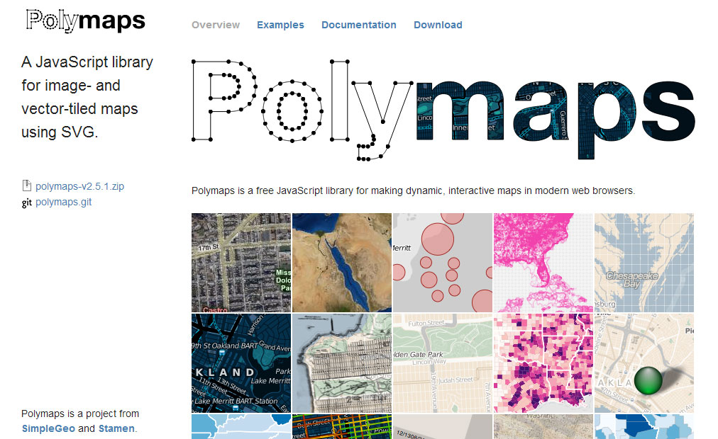 Need to display complex data sets over maps? Polymaps is a free JavaScript library and a joint project from SimpleGeo and Stamen. This complex map overlay tool can load data at a range of scales, offering multi-zoom functionality at levels ranging from country all the way down to street view.
20. NodeBox
A family of open-source tools developed by the Experimental Media Research Group, NodeBox offers capabilities ranging from a cross-platform graphics library to a Mac app that creates 2D visuals coded with Python.
21. Processing
Processing was originally created as a means to teach computer fundamentals in a visual context, but is now used by students, designers, researchers, artists and hobbyists to create learning modules, prototypes and for actual production. Users can create simple or complex images, animations, and interactions.
Processingjs.org
The sister site of Processing, Processing.js is the tool you need to transition your complex data visualizations, graphics, charts and other visuals to a viable web format without any extensions or plugins. That means you can write code using the standard Processing language and insert it into your website, while Processing.js makes it functional without additional coding requirements.
Key Features:
- Allows Processing code to be run by any HTML5 browser
- Integrate animated and interactive visualizations into any web page
- No major additional coding necessary
22. Tangle
Tangle is a JavaScript library and tool that takes visualizations beyond the visual, allowing designers and developers to create reactive programs that provide a deeper understanding of data relationships. For example, a web-based conversion calculator that converts currency or measurements.
23. D3.js
A JavaScript library for creating data visualizations with an emphasis on web standards. Using HTML, SVG and CSS, bring documents to life with a data-driven approach to DOM manipulation — all with the full capabilities of modern browsers and no constraints of proprietary frameworks.
Key Features:
- Bind arbitrary data to DOM
- Create interactive SVG bar charts
- Generate HTML tables from data sets
- Variety of components and plugins to enhance capabilities
- Built-in reusable components for ease of coding
24. FF Chartwell
FF Chartwell transitions simple strings of numbers into editable data visualizations for further customization using OpenType features. It’s an extension that can be used with a standard design suite, such as Adobe Creative Suite, to simplify the process of designing charts and graphs.
25. Google Maps
Google Maps offers several APIs for developers, such as Google Earth, Google Maps Images, and Google Places. These tools enable developers to build interactive visual mapping programs for any application or website.
26. SAS Visual Analytics
Visual Analytics is a tool for exploring data sets of all sizes visually for more comprehensive analytics. With an intuitive platform and automatic forecasting tools, SAS Visual Analytics allows even non-technical users to explore the deeper relationships behind data and uncover hidden opportunities.
Key Features:
- Deploy on-premise or in a public or private cloud
- Drag-and-drop autocharting chooses the best layout for data
- Pop-up boxes identify potentially important correlations
- Scenario analysis enables predictions based on variable changes
- Save views as reports, images or SAS mobile apps
- Create web-based, interactive reports
- Easy integration of action elements for users to manipulate data
27. Highcharts
Highcharts is a library that is written in JavaScript. It provides a simple way to add interactive charts to your web app or website.
28. Visually
Visually is a platform for data visualization and infographics. It has a collection of numerous online contents. This app enables you to share data visualizations with others.
30. Google Charts
Google Charts is free data visualization tool is an interactive cloud service that creates graphical charts from the information supplied by users. You can use it to make a simple line chart or complex hierarchical tree.
31. Chartblocks
Chartblocks is an app that helps you to build charts. This cloud-based tool enables you to embed charts to any website. You can use it to customize any charts and synch with any data source.
32. Ember Charts
Ember Charts is a charting library built-in JavaScript. It is one of the best open source data visualization tools which helps you to create a bar, pie, and many other editable charts
33. Sigmajs
Sigmajs is an online app that is made for creating a graph. This app helps you to customize your drawing. You can also publish the final result on any website.
34. Raphael
A JavaScript library for creating vector graphics on the web, Raphael uses SVG and VML so that every graphic created is also a DOM object. Raphael’s goal is to enable vector graphics creation with cross-browser compatibility.
Key Features:
- Include Raphael.js in a web page for functionality
- Create a variety of charts, graphs and other data visualizations
- Multi-chart capabilities
35. Inkscape
 Inkscape offers functionality similar to that of more expensive applications, such as Corel Draw and Illustrator, yet it’s an Open Source editor for vector graphics. Inkscape supports many advanced SVG features for ease of use and encourages developer collaboration in a community environment.
Key Features:
- Handles complex graphic tasks similar to standard software
- Native SVG format
- Create website mockups
- Bitmap import and display capabilities
- Files stored as vector graphics
36. Leaflet
An Open-Source JavaScript library, Leaflet is a tool for creating mobile-friendly, interactive maps. Developed by Vladimir Agafonkin and a team of contributors, Leaflet was designed with the goals of simplicity, performance and usability.
Key Features:
- Works on all major desktop and mobile browsers
- Various plugins for extended capabilities
- Incorporate interactive features
- Multiple available map layers
- CSS3 features for streamlined user interaction
- Eliminates tap delay on mobile devices
37. Crossfilter
Exploring large multivariate data sets in a browser is made possible by Crossfilter, a JavaScript library that’s capable of handling data sets with more than a million records. Crossfilter uses semantic versioning and creates data visualizations easily using values, objects and other components and commands for customization. It was actually built to power analytics for Square Register to enable merchants to manipulate sales and purchase data
38. OpenLayers
Insert a dynamic map on any web page with OpenLayers. It implements a JavaScript API for building web-based geographic applications and works in most modern web browsers with no server-side dependencies. It’s an open-source software with a new edition in the works, OpenLayers 3, which incorporates the most recent HTML5 and CSS features and enhance 3D capabilities.
39. Kartograph
A Python library and JavaScript library in one, Kartograph caters to developers who want to create Illustrator-friendly SVG maps and interactive maps that will work across all major browsers.
Key Features:
- Two libraries: Python and JavaScript
- Kartograph.js creates interactive maps in minutes
- Stand-alone; no server required
- Kartograph.py creates compact SVGs using Visvalingam simplification
- Layer data sets on maps for multi-layer visualization
40. Microsoft Excel
Microsoft Excel is widely noted for its data manipulation and analysis capabilities, but it’s often used to create powerful data visualizations. The latest edition of Excel is packed with visualization tools, including recommended charts, quick analysis of the different ways to display your data, and a multitude of control options to change the look and layout of your visualizations.
Key Features:
- Perform data analysis and create visualizations in the same program
- Compare various ways to represent your data
- Change tile, layout and other format options
- Excel recommends the best visualization for your data
- Compatible with Microsoft Office products
41. Infogram
Infogram is an easy to use infographic and chart maker. Create and share beautiful infographics, online reports, and interactive maps. Make your own here.
42. Flot
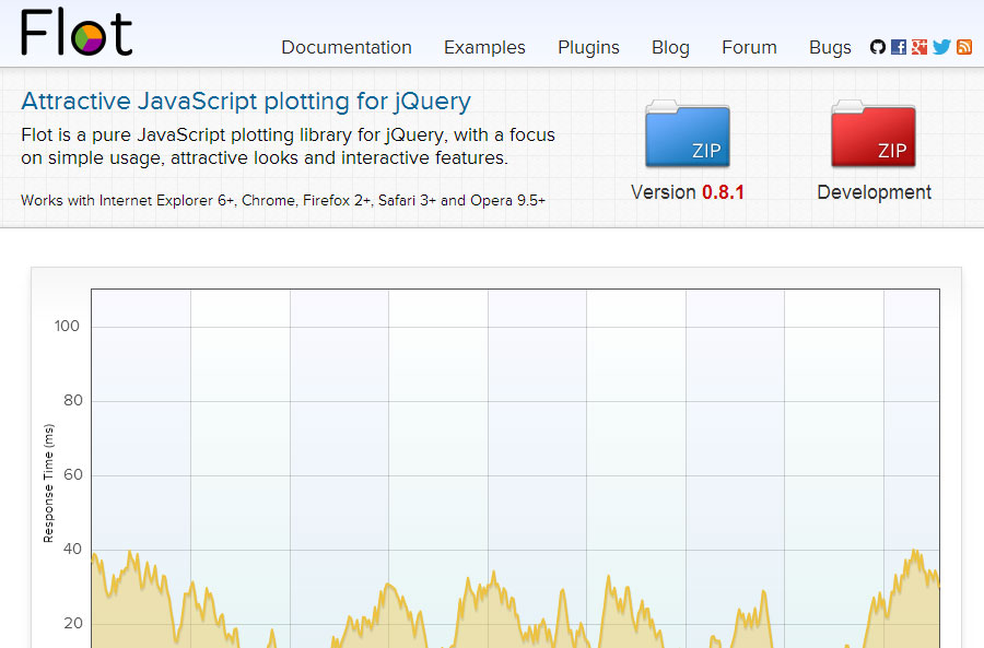 A JavaScript plotting library for jQuery, Flot is a browser-based application compatible with most common browsers — including Internet Explorer, Chrome, Firefox, Safari and Opera. Flot supports a variety of visualization options for data points, interactive charts, stacked charts, panning and zooming, and other capabilities through a variety of plugins for specific functionality. A more easy to use alternative would be to create charts and graphs with the help of a WordPress table plugin.
Key Features:
- Supports lines, plots, filled areas in any combination
- Use combinations of display elements in the same data series
- Plot categories and textual data
- Add HTML with standard DOM manipulation
- Produce interactive visualizations with a toggling series
- Direct canvas access for drawing custom shapes
Visualization alternatives
Why column charts are inappropriate for temperature? Well, column charts are used to show magnitude, with height being the visual variable used for encoding, and the zero-baseline is essential. They are typically used for ratio scale or absolute quantity data (e.g., population, sales, frequency counts). The height of the column is directly proportional to the value, allowing for easy, accurate comparison of ratios (e.g., one bar being twice as tall means the value is twice as large). Temperature scales like Celsius () and Fahrenheit () are interval scales. The zero point is arbitrary (it doesn’t mean “no temperature” or “absence of heat”), and although the case is the freezing point, it is still inadequate. Furthermore, when using the zero-baseline for temperatures, the visual representation can be misleading, visually distorting the variability and difference between months and reducing it.
Moreover, there is a visual inconsistency when columns are used to display the temperature for a specific year (such as 2025) while lines are simultaneously employed to represent the temperature of previous years (such as 2024) or the normal reference period. This mixing of chart types for the same kind of data (temperature over time) hinders direct comparison and can confuse the reader about which magnitude is being emphasized. Additionally, this increases cognitive load, as the reader must first identify the midpoint of the line and then mentally compare its position with the height of the column, adding an extra step and reducing the clarity of the message.
Here are the alternative visualization tools conditioned by its objective and also by the audience.
| Package | Description |
|---|---|
| tidyverse | Collection of packages (visualization, manipulation): ggplot2, dplyr, purrr, etc. |
| ggh4x | a flexible extension for ggplot2 that provides advanced and less common graphic components |
| climaemet | a specialized tool that simplifies the download, cleaning, and preparation of meteorological and climate data directly from the Spanish State Meteorological Agency (AEMET) |
| ggdist | an extension for ggplot2 specialized in visualizing distributions and uncertainty using tidy data principles |
| ggbeeswarm | provides quasirandom and beeswarm plots for ggplot2 |
| ggtext | improved text rendering support for ggplot2 |
| geomtextpath | an extension of the ggplot2 package, designed to simplify the process of adding text in charts, especially when you need the text to follow a curved path |
| ggrepel | provides geoms for ggplot2 to repel overlapping text labels |
| MetBrewer | provides color palettes based on objects from the Metropolitan Museum of Art in New York |
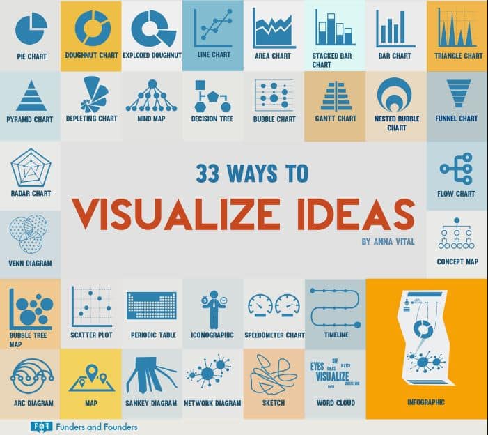
Cheatsheet for Visualization ideas
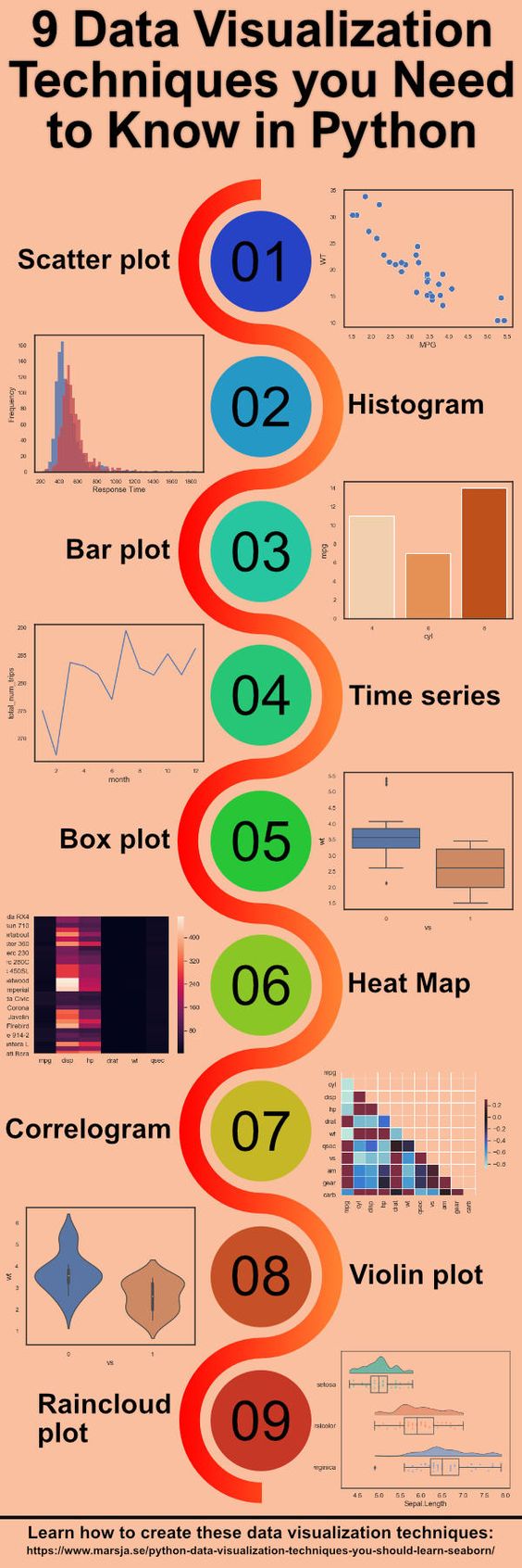
9 Data Visualization Techniques You Should Learn in Python
Here are the main libraries for data visualization with Python and all the types of charts that can be done with them. We will also see which library is recommended to use on each occasion and the unique capabilities of each library. Here are the 9 plots for creating data visualizations in Python.
FAQs:
❓ What is Data Visualization?
Graphical representation of any information or data is known as Data Visualization. This helps in segregating the data in an efficient manner by using various types of visuals such as graphs, maps, charts, maps, and visualization tools.
⚡ Which are Data Visualization Tools?
Data Visualization Tools are software platforms that provide information in a visual format such as a graph, chart, etc to make it easily understandable and usable.
👉 What are the most popular data visualization tools?
Here are the Best Data Visualization Software of 2023.
- Microsoft Power BI.
- Tableau.
- Qlik Sense.
- Klipfolio.
- Looker.
- Zoho Analytics.
- Domo.
👉 Is Excel a data visualization tool?
Excel is one of the best data visualization tools for businesses and professionals. However, this freemium spreadsheet tool comes with very basic charts and graphs, such as Pareto and Grouped Bar Charts.
🌟 Why do we use Data Visualization?
The main goal of data visualization is to make it easier to identify patterns, trends and outliers in large data sets. The term is often used interchangeably with others, including information graphics, information visualization and statistical graphics.
👉 Which factors should you consider while selecting a Top Data Visualization Tool?
How to Choose the Right Data Visualization
- showing change over time.
- showing a part-to-whole composition.
- looking at how data is distributed.
- comparing values between groups.
- observing relationships between variables.
- looking at geographical data.
(Updated on 28 Dec 2024)
Related Posts

Building an AI-Ready Data Strategy: What Every Enterprise Should Get Right Before Scaling Artificial Intelligence
July 16, 2026Enterprise AI initiatives rarely stall because teams lack access to capable models. ...

What Social Media Analytics Actually Tell You – and What They Don’t
July 13, 2026If you work in data, you have probably watched a marketing team ...

Best 7 Revenue Intelligence Solutions for Technical Sales Teams
June 26, 2026Technical sales teams operate in a fundamentally different environment than most B2B ...

5 Best Social Intelligence Tools for 2026
June 15, 2026Social intelligence has become one of the most important capabilities for brands ...

The 2026 Data Observability Vendor Database: 20+ Platforms by Founding Year, Funding, Hosting, and Pricing
June 12, 2026The data observability market has evolved rapidly over the past five years. ...