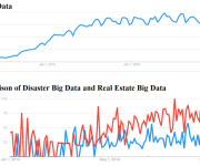
Pictures Make Sense of Big Data
Most people have trouble recalling strings of numbers that are longer than their phone numbers. So how do we begin to comprehend a hundred rows of data, let alone a thousand or a million or a billion rows?
That’s the dilemma so many companies face, thanks to technology advances that make it easier to routinely collect enormous amounts of data.
The answer is pictures.
Humans are fundamentally different from computers—we’re wired to comprehend shapes, patterns and colors. So technology companies are using data visualization to help companies turn large sets of data into pictures that lead people intuitively to the information that is most important to them.
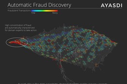
That can mean something as familiar as a color-coded map, only with lots of interactive features. Or it can mean something unfamiliar to most people, like seemingly amorphous shapes that on closer inspection quickly yield insights into the data they portray.
One picture that’s still considered effective was published in 1869 by the Frenchman Charles Minard (http://en.wikipedia.org/wiki/File:Minard.png). It shows the casualties suffered by the French army during Napoleon’s disastrous invasion of Russia in 1812 and 1813.
By using two colored lines—one for the army’s advance and one for its retreat—and varying their thickness as the army’s position and its numbers changed, Mr. Minard showed how many men advanced into Russia and how many returned at various locations. A third graph shows the freezing winter temperatures the men encountered as they retreated to France.
Today, Mr. Minard’s picture wouldn’t be static. We would be able to dig into it, clicking to find out how many men died on a given day and perhaps correlate those numbers with other data, such as the amount of food available or the types of weapons used. We would have more ways to visualize the data—we could lay it against a map—and we could monitor the reaction to it on Twitter.
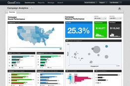
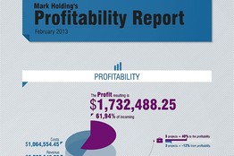
Below are some examples of what technology companies are doing today to show us big data in pictures.
GOODDATA
AYASDI
TIDEMARK
By DEBORAH GAGE Read more


