Readability: The Secret to Boosting Content Engagement

Writing engaging content opens the door to both improved user experience and better search engine rankings. An engaged user is satisfied, having found what they were looking for, and is enjoying your website, which also makes them more likely to convert. They are also signaling to Google that your page is of high quality and that it matches their search intent.
A factor that plays an important role in boosting engagement is readability. Content that is difficult to get through and consume will rarely see high conversion and engagement rates. Let’s explore what you can do to improve your content’s readability.
Use Visuals to Communicate
In order to enhance the value of your content, you will need to supplement written communication with visual information.
Digital readers don’t read their screens like they do books, and they will not appreciate walls of text. They are expecting some sort of visual interest, whether in the form of image or video.
While writing, try to come up with visuals that will add another layer of meaning to your post. Could you include screenshots? Do you have a video on the subject? Can you make a chart?
Even if you will be adding stock photos, make sure that they aren’t randomly selected. Choose images that add an emotional or associational layer of meaning to your words.
Check out this Going article on using Google to find cheap flights. It’s enhanced with screenshots to clearly support the messaging of the written content. Doing this makes the reading process much easier for the visitor; just imagine how complex this post would have been if it relied entirely on text alone.
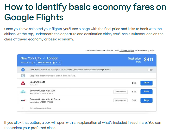
Source: Going.com
Experiment With Column Layout
In order to make your pages more interesting and visually appealing, consider using a column layout instead of the usual one-column formatting.
It can help you hold on to your reader’s attention, as they are able to take in more information at once and be exposed to more value.
Note that this style will not work for average blog posts, but it can work for a Q&A-style post, for example. This MarketBeat post on stock market holiday utilizes this concept well. Due to the nature of the topic, they are able to place two charts at the top of the page, which provide readers with all the most relevant information they are looking for.
The question-and-answer style content below works much better formatted at two columns, as it shortens the time readers require to find what they are looking for, and they are not expected to read the entire post.

Source: Marketbeat.com
Apply Typography Best Practices
In order to make your content more readable, make sure to also employ typography best practices:
- Limit the number of fonts you use on a page to a maximum of two. One will often be more than enough.
- Use standard fonts. Arial, Times, Verdana, and Tahoma are among the most popular ones for a reason: they are easy to read on any screen.
- Make sure there is plenty of white space between lines. The line spacing should be about 30% more than the character height to ensure readability.
- Provide plenty of white space on either side of the text too.
- Avoid using various colors of text. Choose one and stick to it, and ensure it contrasts well with the background.
- Make sure font sizes adjust to different screen sizes.
- Use bold and italic where needed.
- Create bullet and number lists whenever appropriate. It will make the information easier to digest.
Write Descriptive Headings
Carefully crafted headings can instantly boost the readability of your articles. As most readers don’t want to read a piece of content from top to bottom, they will simply skim through the headlines. When they come across a point of interest, they will stop to read that particular section.
By summarizing the point of the entire section in the heading, you can provide more value and ensure readers don’t get lost in your content. They can choose to engage with the parts that are interesting to them and have a much better experience of reading.
Check out this step-by-step guide to competitive landscape analysis. If you were to just read the headlines, you would already know what the steps are, and you could theoretically get right down to work. If there is a step you are unsure about, you can pause to read through that section.
By enabling skimming, you are significantly helping search engines as well, who will use your headings to determine what your page is about.
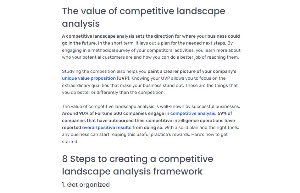
Source: Oktopost.com
Add A Hyperlinked Table of Contents
When a visitor lands on your page, they want to know as soon as possible if the answer they are looking for is there. They would prefer not to scroll for a couple of minutes if they don’t have to.
Apart from the descriptive and informative headings, this is where a table of contents comes into play. Adding it to the top of your content will help users skim through the entire article in a matter of seconds. They will then know if they want to engage with the content further.
If you have done a good job of matching search intent and you have written a quality article, they will stay and engage with the page further.
Check out this ultimate guide to remote work for startups by Trustshoring. They have a scrollable table of contents to the left of the article, which provides an even better user experience than placing it at the top of the text.
What’s even more important, the table of context is hyperlinked, so readers can instantly jump to the sections they are interested in and skip everything else.
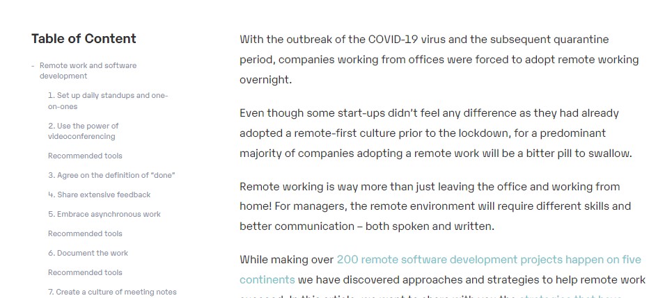
Source: Trustshoring.com
Wrapping Up
By considering the above readability tips, you will instantly make your content more appealing and engaging to visitors. Try to visualize what a post will look like while writing it: it will help you find the appropriate visuals and deploy the best formatting practices.
Related Posts

What Social Media Analytics Actually Tell You – and What They Don’t
July 13, 2026If you work in data, you have probably watched a marketing team ...

Best 7 Revenue Intelligence Solutions for Technical Sales Teams
June 26, 2026Technical sales teams operate in a fundamentally different environment than most B2B ...

5 Best Social Intelligence Tools for 2026
June 15, 2026Social intelligence has become one of the most important capabilities for brands ...

How Data Driven Consumers Can Save More on Wireless Plans with Mint Mobile
June 2, 2026Mobile users are becoming more analytical about how they choose wireless service. ...

The Best AI-Driven Market Intelligence Platforms for Institutional Investors
April 7, 2026This article explores the leading AI-driven market intelligence platforms transforming how institutional ...