Beyond Aesthetics: The Psychology of Colours in Graphic Design
In the vast realm of graphic design, colours play a pivotal role that extends beyond mere aesthetics. They possess the remarkable ability to evoke emotions, convey messages, and influence perceptions. Understanding the psychology behind colours is not just an artistic endeavour; it’s a strategic tool that designers use to connect with audiences on a deeper, subconscious level.
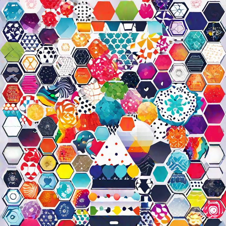
Unravelling the Palette: More Than Meets the Eye
The Power of First Impressions
In the blink of an eye, colours make a lasting first impression. Consider the boldness of red, the tranquillity of blue, or the freshness of green. These initial perceptions often set the tone for how users engage with a design.
Emotional Resonance
Colours have a unique ability to stir emotions. Warm tones like reds and yellows can evoke feelings of passion and energy, while cooler shades like blues and greens may bring about a sense of calm and serenity. Understanding this emotional resonance allows designers to craft experiences that resonate with their audience. This is what expert graphic designers like Pixelo Design Australia do.
The Colour Wheel: Crafting Intentional Experiences
Cultural Nuances
Colours don’t speak a universal language. The interpretation of colours can vary significantly across cultures. For example, while white symbolizes purity in Western cultures, it represents mourning in many Eastern cultures. Navigating these cultural nuances is crucial for global design endeavours.
Contrast and Complementarity
The juxtaposition of colours can create a visual symphony or a discordant clash. Understanding the principles of contrast and complementarity is akin to wielding a magic wand in the hands of a designer. A well-balanced palette guides the user’s eye seamlessly, enhancing the overall user experience.
Practical Applications: Bringing Theory to Life
Branding Identity
Think of iconic brands, and the colours associated with them immediately come to mind. The golden arches of McDonald’s, the bold red of Coca-Cola – these colour choices are not arbitrary. They are strategic decisions aimed at etching the brand into the consumer’s memory.
Call to Action
In the digital age, where attention spans are fleeting, colours play a pivotal role in directing user actions. Whether it’s a vibrant button urging a click or a subdued colour guiding a user through a journey, the right colour choices can significantly impact conversion rates.
Breaking the Mould: Pushing Design Boundaries
Minimalism and Maximalism
Design trends evolve, and so do the preferences of audiences. From the sleek minimalism of grayscale to the vibrant maximalism of eclectic palettes, designers constantly push boundaries. Understanding the psychological implications of these choices allows for more intentional and impactful designs.
Accessibility Matters
In an era of inclusivity, the importance of colour accessibility cannot be overstated. Designers must consider the needs of all users, including those with visual impairments. Crafting designs that are both aesthetically pleasing and accessible is a challenge that demands a thoughtful approach.
Evoking Nostalgia: The Timeless Allure of Retro Colours
A Journey Through Time
In the fast-paced world of design, where trends come and go, there’s something enduring about the charm of retro colours. The soft pastels of the ’60s, the vibrant neons of the ’80s – these hues carry a nostalgic weight, invoking memories and sentiments that resonate across generations.
The Retro Renaissance
Designers are increasingly turning to retro colour palettes to infuse a sense of familiarity and comfort into modern creations. Whether it’s the warmth of sepia tones or the boldness of disco-era hues, retro colours add a layer of timeless sophistication to contemporary designs.
Emotional Time Travel
The psychology behind retro colours goes beyond mere aesthetics. It taps into the collective memory, triggering emotions associated with specific eras. The muted tones of vintage photographs or the vibrant saturation of retro advertisements can transport users to a different time, creating a unique and immersive experience.
Balancing Nostalgia with Modernity
Integrating retro colours into contemporary design is an art that requires a delicate touch. Striking the right balance between nostalgia and modernity allows designers to create pieces that feel both familiar and fresh. It’s a testament to the enduring power of colour to bridge the past and the present.
The Future Palette: Trends and Innovations
Technological Influences
As technology advances, so do the possibilities in colour usage. Virtual and augmented reality bring forth new dimensions where colours can influence not just the visual but also the experiential. The fusion of design and technology opens doors to innovative ways of engaging users.
Sustainability in Design
With environmental consciousness on the rise, designers are embracing sustainable colour choices. Earthy tones and eco-friendly palettes not only align with environmental values but also convey a sense of responsibility and mindfulness.
Conclusion: The Art and Science of Colour
In the realm of graphic design, colours are both the artists’ palette and the scientists’ experiment. The psychology of colours is a nuanced dance between aesthetics and strategy, emotion and cognition. As designers, understanding this intricate interplay allows us to transcend the superficial, creating designs that resonate, communicate, and endure. So, the next time you pick a colour for your design, remember, it’s not just a hue; it’s a storyteller, a mood-setter, and a silent communicator.
Related Posts

Maybe It’s Time That Your Singaporean Business Considered New Interior Design Ideas
November 24, 2025People get bored with how their homes look here in Singapore, and ...

Data Quality in Lead Generation Company — Why It Matters
October 17, 2025In modern B2B marketing, every outreach decision starts with data. Whether you’re ...

Building Digital Trust: Why Web Development Is Now a Brand Strategy
September 13, 2025In 2025, consumers no longer separate a brand’s identity from its digital ...

How Responsive Web Design Shapes Digital Success
September 3, 2025Why Responsive Web Design Matters With rising digital consumption on smartphones and tablets, ...

3D Modeling Made to Order: Realizing Your Ideas in the Digital World
August 8, 2025Custom 3D Modeling Services: Transforming Ideas into Digital Reality The demand for 3D ...