Best Data Visualization Projects of 2025

Data visualization continues to be a critical tool for transforming complex data into actionable insights. The best data visualization projects of 2024, 2025 showcase innovative approaches that blend technology, creativity, and storytelling to present data in compelling ways. This article highlights 11 standout examples across various industries, including healthcare, finance, climate science, and education. Each project demonstrates mastery in design, interactivity, and user engagement, leveraging tools like Tableau, Power BI, D3.js, and AI-powered platforms. These visualizations not only enhance decision-making but also set new standards for how we interpret and communicate data in a visually-driven world.
Best Data visualization projects of 2025:
1. Inside the Confusing World of Women’s Clothing Sizes
They approached the topic from several angles with 3-D models, data collection, and sizing charts. Adding to the visualization genre of variable clothes sizes, this piece helped me appreciate the process that is women’s shopping. [ See the Project]
2. Your Zodiac Sign Is 2,000 Years Out of Date
The visualized shifts in time changed my perception of zodiac signs forever. I’m exaggerating. But this piece came at a welcome time during the year. [See the Project]
3. How California fights fires from the skies
Wildfires hit Southern California fast and hard. This piece illustrated, with maps, charts, and diagrams, how firefighters organized to fight the fires. As a Californian, I appreciated the timeliness. [See the Project ]
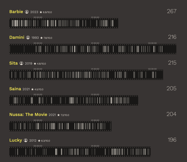
4. 30 minutes with a stranger
I am continually impressed by the connection between abstract data and reality. Chang understands and knows how to help you see the individual data points in the field of aggregates. [See the Project ]
5. Museum of All Things
We use Wikipedia as a reference to look up specific facts but there is also an exploration phase that sends us down rabbit holes. Claire turned the rabbit hole into an infinite museum. [See the Project ]
6. Eroding Protections for Public Lands
The key to my visualization heart is through vintage feels that look like they came from a 19th century statistical atlas. [See the Project ]
7. Swept Away
A reconstruction of the flooding at Camp Mystic provided perspective on multiple levels. [See the Project]
8. Size of Life
The illustrations. The music. The sound. The interaction. It all comes together to present a familiar topic, beautifully executed. [See the Project ]
9. Bird migration is changing. What does this reveal about our planet? – visualised
Animated maps, illustrations, and sounds help you understand flight of the birds. [See the Project]
10. Motorway Cycle XI
Wilcock transforms everyday movements into music. It is one thing to sonify data and another to turn it into calming tunes. [See the Project]
Best Data visualization projects of 2024:
1. This is Not My Name
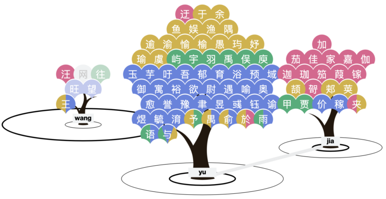
Liuhuaying Yang: I kind of knew about the convergence of Chinese names from experience, but this research project taught me something new. The audio pronunciation helps too. [See the Project]
2.Your Name In Landsat
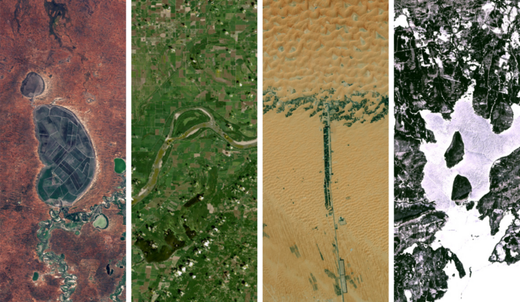
NASA Landsat Science: NASA should make more things with fun and quirks, alongside the isn’t-space-amazing videos. [See the Project ]
3.Climate—Conflict—Vulnerability Index
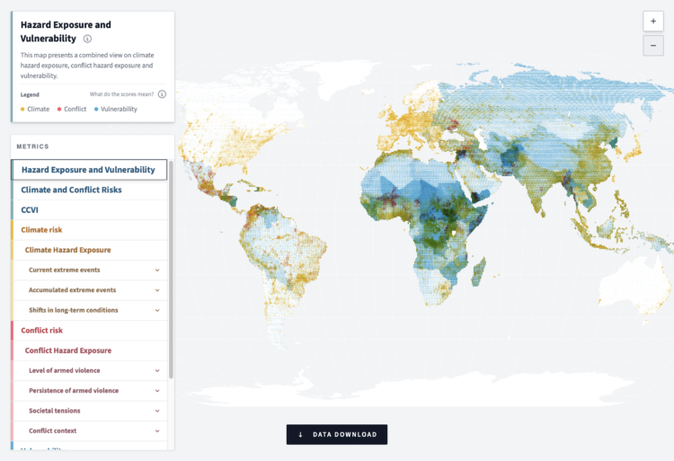
German Federal Foreign Office: The point is to create and maintain a dataset so that we can understand the changing risks worldwide. The interactive map helps you understand the data. [See the Project ]
4. When A.I.’s Output Is a Threat to A.I. Itself
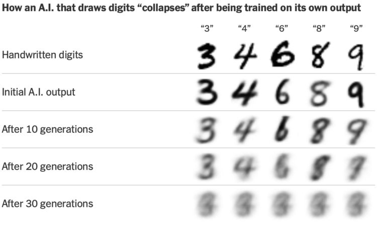
Aatish Bhatia for The New York Times’ Upshot: There were quite a few projects that demonstrated the convergence that is AI output, but this one stood out for showing how we get there. [See the Project]
5. I shrink 10x every 21s until I’m an atom

Epic Spaceman: It is impossible to tire of seeing the scale of all the things. I appreciated the focus on relative size over the unit measures. [See the Project]
6. Full Of Themselves
Dominikus Baur and Alice Thudt: I truly enjoy the unnecessary explorations of small curiosities. Plus they led with Back to the Future. [See the Project ]
7. The mullet is alive and well in AFL
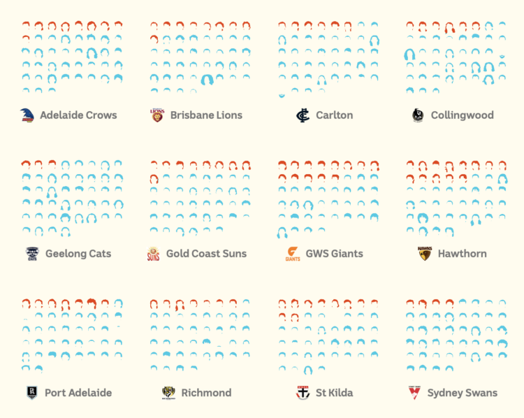
Alex Lim, Katia Shatoba, and Thomas Brettell, for ABC News: One thing you don’t know about me is that I had a mullet when I was a kid. A really bad one. This work resonated with me. [See the Project ]
8. A torrent of trash

Sudev Kiyada, Han Huang, Adolfo Arranz, and Simon Scarr, for Reuters: The illustrated balloons with bags of garbage attached are perfect as you scroll. [See the Project ]
9. The United States of Abortion Mazes
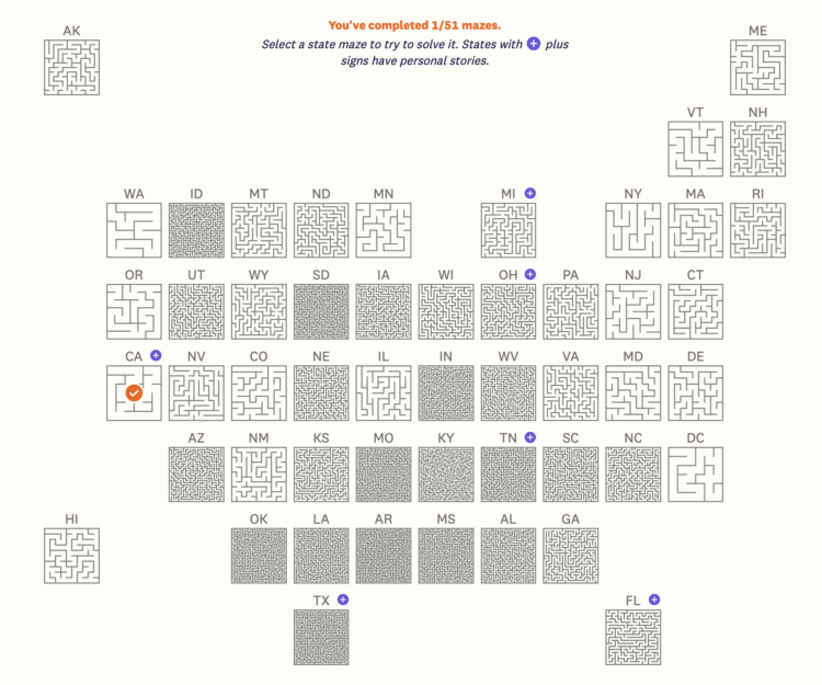
Jan Diehm and Michelle Pera-McGhee for The Pudding: The metaphor and playable mazes for each state were perfect. [See the Project / On FlowingData]
10. How Uber and Lyft Used a Loophole to Deny NYC Drivers Millions in Pay
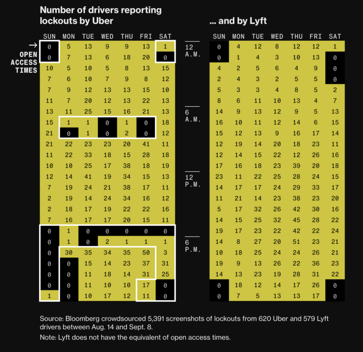
Natalie Lung, Leon Yin, Aaron Gordon, and Denise Lu for Bloomberg: The ad hoc data collection yielded a clear pattern across Uber drivers. [See the Project]
11. Parallel Lives
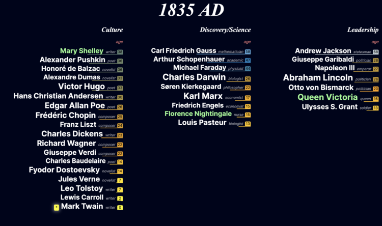
Jan Willem Tulp: As a middle-age person feeling middle-age things, I appreciated seeing the age of notable people throughout history. [See the Project]
Conclusion:
The data visualization projects of 2024 exemplify the growing importance of clear, interactive, and impactful data storytelling. They demonstrate how innovative tools and creative approaches can turn complex datasets into accessible insights that drive meaningful decisions. As we look ahead, these projects set a benchmark for leveraging technology and design to communicate data effectively, inspiring professionals across industries to push boundaries and make data more comprehensible and actionable. The future of data visualization lies in its ability to bridge the gap between raw data and human understanding, fostering informed decision-making in an increasingly data-driven world.
Related Posts

Best 7 Revenue Intelligence Solutions for Technical Sales Teams
June 26, 2026Technical sales teams operate in a fundamentally different environment than most B2B ...

5 Best Social Intelligence Tools for 2026
June 15, 2026Social intelligence has become one of the most important capabilities for brands ...

The 2026 Data Observability Vendor Database: 20+ Platforms by Founding Year, Funding, Hosting, and Pricing
June 12, 2026The data observability market has evolved rapidly over the past five years. ...

7 Top Autonomous AI Pentesting Platforms in 2026
June 10, 2026Autonomous penetration testing is becoming one of the most important changes in ...

6 Leading Red Teaming Companies for Enterprises in 2026
June 6, 2026Red teaming has changed from a technical exercise into a leadership test. ...